
Web form optimization is often one of the most neglected aspects of building a website. This is surprising due to how many sites rely on forms as their main lead generators. Countless hours are spent designing the user experience that drives users to form pages, and just as much effort should be invested in ensuring the final touch point is a true conversion machine.
A nicely designed and user-friendly form can drastically boost submissions and decrease abandonment rates. Expedia once famously increased sales by $12-million by deleting a single field on their checkout page. A confusing field labeled “Company name” had users entering the name of their bank, as opposed to their home address. Removing the field resulting in a substantial increase in sales, overnight.
The overarching goal is to keep it simple and self-explanatory. Things like validation errors and confusing field labels result in frustrated customers banging on their keyboards. Ready to make some killer forms? Let’s get started.
15 Steps For Web Form Optimization
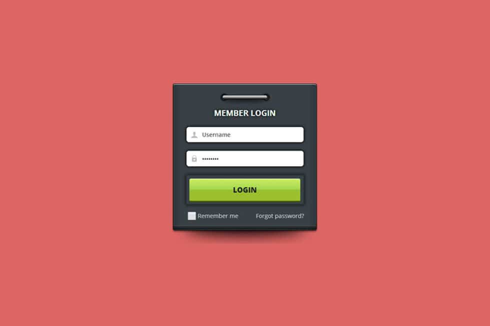
1. Neatly organized labels and fields
Fields should be stacked vertically and left-aligned. Labels should sit on top of the fields and also be left-aligned. This setup allows the eye to quickly scan the form to understand what information is required.

2. Clear label names
Make sure field labels are crystal clear. You can’t expect submissions if people are confused regarding what information you want from them.
3. Appealing visual design
Keep your forms clean, neat and don’t be afraid to enhance them with colors and icons to improve legibility. Also, consider how color impacts usability. You can never go wrong with black or dark grey text on a white background, or colorful call-to-action buttons.
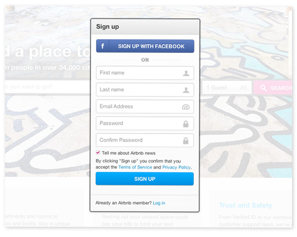
4. Calls to action
LinkedIn lets you know upfront that registration is free and takes just a few minutes. This well-placed call-to-action sets expectations and alleviates preconceived notions many have about filling out web forms. Often, they are long and arduous, only to end with a prompt to enter credit card info.

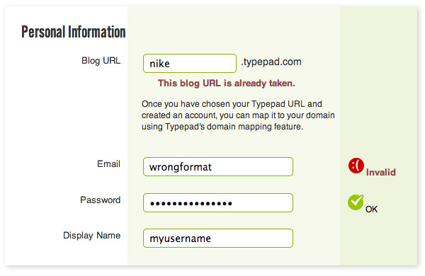
5. In-line validation
Each field should self-validate in order to help the user get through the process. For example, an email address entered in the incorrect format should trigger an error message before the user submits the form. Make error messages descriptive enough to be self-explanatory. In the example below, it would be nice to see a hint explaining the expected email format (e.g. yourname@email.com).
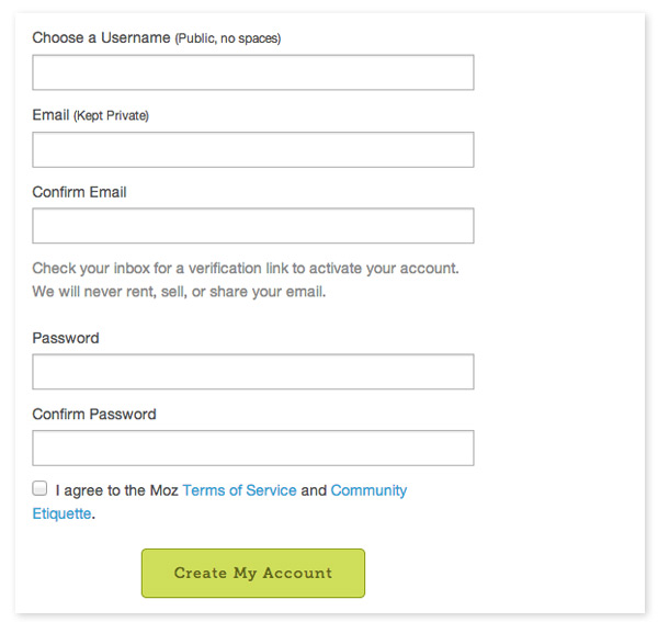
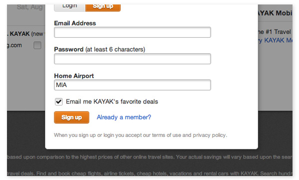
6. Simplicity
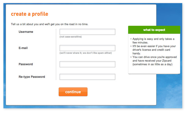
A long history of web spam, scams, security vulnerability and form overload has created a hesitancy for people to give out too much personal information. Keep your forms limited to the basic info that people are accustomed to giving out. In most cases Name and/or Username, Email and Password will suffice. Low barrier to entry is necessary to boost form submissions.
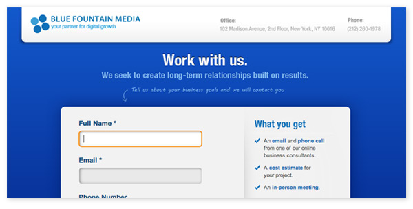
7. Set Expectations
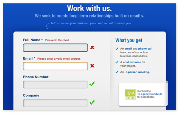
Clearly indicate which fields are mandatory, tell people what happens after they submit and give them confidence they can trust you with their information. In the below example for a Request a Quote form, the user’s expectations are clearly set under the “What you get” section, and trust is built with the awards badge from IMA.
8. Helpful hints
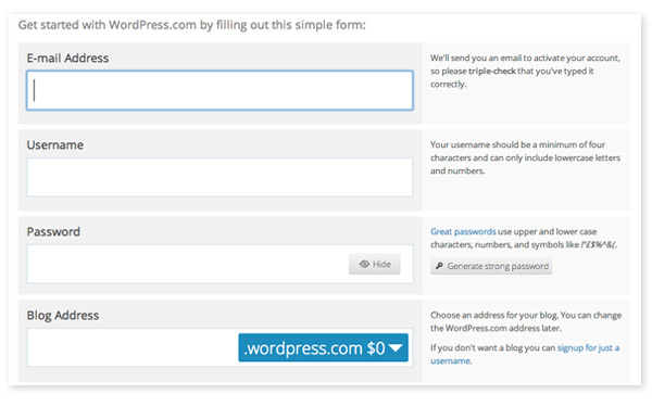
Field labels should contain simple hints or suggestions that aid the user. A common practice is to give hints in a light gray text. This ensures the added text isn’t a distraction. WordPress provides very detailed hints to the right of each field, as well as helpful tools for creating passwords. This builds trust and shows the user you are there to help them each step of the way.
9. Enable cookies
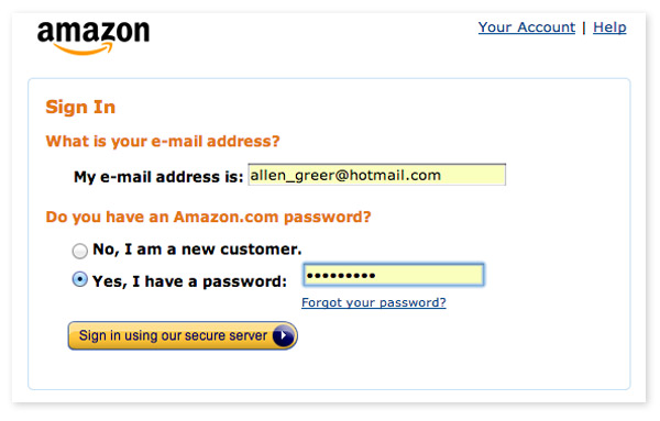
If you are creating forms for repeat customers, storing cookies will allow auto-population of basic information for faster submission. The retail giant Amazon does a wonderful job at storing cookies that make repeat transactions a breeze.
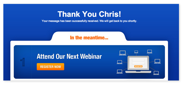
10. Thank You page
Creating a Thank You page on a separate URL is good for two reasons. Firstly, it tells users their submission was successful and thanks them for taking the time. Secondly, it allows the site owner to install event tracking scripts to monitor the success rate of the form. In the below example, a clever promotion for registration to a Webinar is included on the Thank You page.
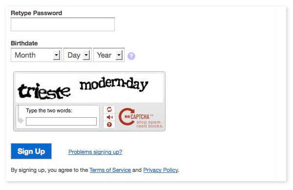
11. Captcha
For sites that anticipate a lot of web spam, implementing Captcha is the most effective method to ensure humans (not robots) are filling out forms. Captcha is also useful for user account level forms that allow people to change their passwords or billing info. While many captchas are quite annoying and burdensome, there are common options (see below) that are quite user-friendly and intuitive enough to not cause massive confusion.
12. Reduce ability to leave page
Once you have a user on a form page, the goal is to reduce clutter and distraction, to allow them to focus on completing the task at hand. A great way of facilitating this is to completely remove the site header, including the navigation menu. This tactic is not appropriate for every situation, but keep it in mind for forms like Request a Quote or Request a Consultation.
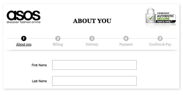
13. Progress Indicator
For forms that have multiple steps, it’s critical to let users know where they are in the process. The British retailer ASOS provides a simple yet effective progress bar that shows all required steps, as well has how far along in the process a user is (completed steps get highlighted in black).
14. Link to Privacy Policy
Web security is a hot topic these days. Since many are so skeptical about giving out their personal information online, it’s always a best practice to include links to your Terms of Service and Privacy Policy. Legal language protecting a user’s privacy will calm their nerves and allow them to proceed with confidence.
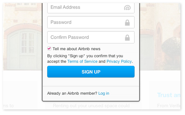
15. Add newsletter signup checkbox
While it may not help with improving form submissions, it’s never a bad idea to include a checkbox that automatically signs users up for your company newsletter. By leaving the box checked, they are opening up the door for remarketing opportunities, which is a fantastic way to keep customers in-the-know about sales, promotions, events, etc.
©2024 FUZE DIGITAL INC. Ignite Your Brand™ | privacy


![]()