Mobile Website & Application Development
The Future is Here
Fuze designs and develops Mobile Apps & Mobile Websites that deliver content to your customers when and where they want it. From native iPhone and Android application development to responsive website design, we provide custom solutions specific to your industry.
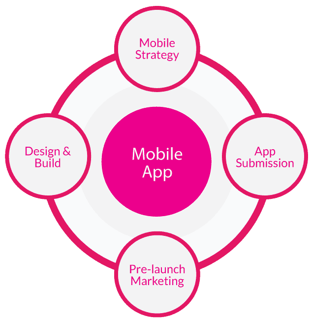
Mobile App & Website Services

Responsive Design
Responsive websites use fluid grids to adapt to fit desktop, tablet and mobile screen sizes. This means your content is delivered to your users when and where they want it.

Mobile Websites
Our dedicated mobile solutions allow complex desktop sites to be simplified for mobile browsing, ensuring users still have access to the most important pages and features..

Mobile Apps
Have an app idea? We plan, design and develop custom native applications for iPhone, iPad and Android devices. Also, ask about our pre and post launch marketing consultation.
Reach Your Audience On Their Terms.
User-centric
We make products that people love using.
Mobile-first
We go big by starting small.
Experience-driven
It’s all about the journey.
Cross-platform
Look good on any device.
Featured Mobile Website Projects

Mood University
Responsive Ecommerce
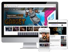
Popcornflix
Responsive Website Design
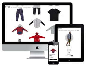
DYNE
Responsive Ecommerce
Featured Mobile App Case Study

The Fifth Wheel
The Fifth Wheel is a startup bike shop in Brooklyn, NY. We developed a custom iPhone application that lets customers search, book and pay for rentals online.
+ Mobile UX & creative design
+ iPhone application development
+ App store launch strategy
+ Read Case Study >
Why Go Mobile?
The Future is Now
The mobile explosion is upon us and early adapters are being handsomely rewarded. Advances in development techniques have made mobile site creation more cost effective and efficient than ever.
Practices like responsive website design facilitate the ability to deliver a coherent user experience across all platforms while keeping content management under the umbrella of a single domain and administration panel.
Mobile internet searches have nearly caught up with those performed on desktops. This means your customers are looking for you on their smartphones and tablets. If your site is optimized only for desktop, you will lose out on tremendous business potential.
Online Marketing Benefits
Google prefers Responsive sites because they share one URL, maintain the same content and adapt to each user’s device type. Efforts like SEO are far more streamlined when maintaining a single website (as opposed to separate sites for desktop and mobile).
Search engines have evolved to reward those who go the extra mile to provide superior user experience, and mobile optimization does just that.
Dedicated mobile sites, on the other hand, offer the ability for hyper targeted search and ad campaigns, as well as segmentation of analytics data. Some sites are far too robust or feature-rich to warrant an adaptive design, making a stand-alone web application the best solution.


