

Google has finally announced that mobile-friendliness is an official part of its search algorithm. More importantly, it has called the update “significant”, meaning sites that do not abide risk suffering the consequences.
Over the past two years, Google has been dropping hints suggesting it prefers websites optimized for mobile devices.
While many sites have since updated to responsive designs that satisfy Google’s requirements, others have chosen to ignore the increasing importance of mobile-friendliness.
For the naysayers or unbelievers, consider the following facts:
– Google is the world’s #1 producer of mobile devices (Android).
– Google is the world’s #1 mobile search engine.
– Google has the world’s largest mobile app store (Google Play).
In other words, Google controls the mobile landscape and has the freedom to write the rules as they see fit.
As announced in March by Google Webmaster Central, Google will be rolling out the most significant mobile algorithm change to date:
Starting April 21, we will be expanding our use of mobile-friendliness as a ranking signal.
It’s important to consider that, historically, when Google calls an algorithm update “significant”, it’s not something that should be taken lightly. In this case, it’s being called more more significant than Penguin or Panda.
Past “significant” algorithm updates include:
– Crawling – 2012
– Markup – 2010
– Linking – 2009
– Panda 1.0 – 2012
As search marketers are aware, the above updates wreaked havoc on those who weren’t abiding by and/or refused to adapt to Google’s guidelines. So, we can only assume the roll-out of an equally significant update will trigger a tectonic shift in the global SEO landscape, causing search rankings to fluctuate, marketers to pull their hair out and site owners to scramble to optimize their websites.
What Can You Expect From the Alogorithm Update
The update will be significant
As previously mentioned, Google is getting serious about mobile, and so should you.
Each page will be assessed individually
This is important because it means every page on your site needs to be optimized for mobile. Today, we see many templated responsive sites being thrown together with little regard for pages outside of the Homepage.
The algorithm operates in real-time
As reported by Search Engine Land:
…the algorithm runs in real-time, so technically, you can do it any day, and as soon as Google picks up on the change, the site will start to benefit from the new mobile-friendly algorithm change.
From this statement, we can assume that Google will pick up mobile-friendliness during it’s normal crawl. So, if you miss the April 21st deadline but go mobile soon after, Google will catch it in the subsequent round of indexing.
The algorithm may evolve to give distinct scores for separate devices
While the usability of some features may be quite similar from device to device, the nature of responsive requires some distinct layout changes to be made to account for ensuring optimal user experience on each device type.
That being said, what’s good for desktop, for example, will not always be good for mobile.
App indexing will be a part of search results
The revamped algorithm will include a feature that impacts only sites with associated Android apps.
In fact, according to Google Webmaster Central, this update is already being used:
Starting today, we will begin to use information from indexed apps as a factor in ranking for signed-in users who have the app installed. As a result, we may now surface content from indexed apps more prominently in search.
The implication of the indexing update is that now, when users click on app-related content from Google Search results or query autocompletions on Android, they will be taken directly to the related mobile app.
Google suggests the following steps in order to enable app indexing:
– Add deep link support and specify how to reach specific content within your app.
– Verify your app’s official website on Google Play Console.
– Provide deep links for each web page that has a corresponding deep link, either on each page of your website or in your sitemaps.
– Check for errors in Webmaster Tools so you can fix them.
Conclusion: How to Prepare for the Update
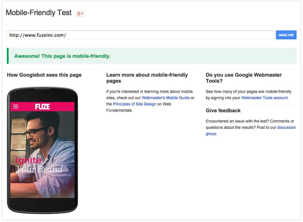
1. Test your site on Google’s Mobile-Friendly Test page. Keep in mind this is a high level and rather generic indicator of the true value your mobile site provides to users.
2. Search for your site on a mobile device and see if Google has applied the “mobile friendly” label.

3. Build a Responsive Website: Responsive design is Google’s preferred way to ensure optimization across all device types. If your website is not responsive, it may be penalized
4. Focus on Mobile UX: A true mobile-friendly experience reaches far beyond a simple Responsive layout. It needs to provide a seamless User Experience that includes elements like properly optimized images, videos, text and navigation that are equally usable on desktops, tablets and phones.
©2024 FUZE DIGITAL INC. Ignite Your Brand™ | privacy


