
I’m here to fill you in on a dirty little secret. Visitors to your website do not care if it’s responsive! What they really want extends much deeper than any trend or technology, and is rooted in some powerful philosophical principles that should always be top of mind when designing a digital product.
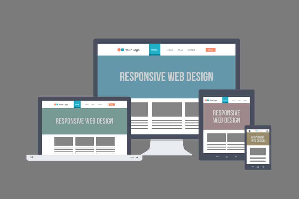
‘Responsive Website Design’ is a generic buzzword that has, for better or worse, become synonymous with making web pages ‘mobile-friendly’. The layperson generally thinks of responsiveness as a website with a front-end layout that looks nice on any device. In other words, content dynamically shrinks and re-arranges to accommodate a tablet or mobile phone regardless of screen size or orientation.
Is responsiveness important? Absolutely! It’s one of the most impactful web-related achievements in history. The overarching issue is responsive design, by itself, is not mobile optimization. Mobile optimization, as we’ll cover later in this article, involves far more than making the design of a site look pretty on an iphone.
Before we get into the weeds on why, as UX expert Brad Frost so bluntly puts it, your visitors don’t give a sh*t if your site is responsive, and what they want instead, let’s step back and review what Responsive Design is and what it was originally intended to accomplish.
The Origins of Responsive Website Design
In the year 2000 a web design practitioner, teacher and author named John Allsopp wrote a brilliant piece that discussed the transition from print to web, the need for adaptability and accessibility in web design and how Daoist (or Taoist) philosophical principles can be used to create “harmony” for all users.
“The flexibility I’ve talked about so far I think of as “adaptability.” Everything I’ve said so far could be summarized as: make pages which are adaptable. Make pages which are accessible, regardless of the browser, platform or screen that your reader chooses or must use to access your pages. This means pages which are legible regardless of screen resolution or size, or number of colors (and remember too that pages may be printed, or read aloud by reading software, or read using braille browsers). This means pages which adapt to the needs of a reader, whose eyesight is less than perfect, and who wishes to read pages with a very large font size.”
A decade later, the term ‘Responsive Web Design’ was coined by legendary web designer, Ethan Marcotte. Inspired by the Interactive Architecture movement, during which architects began designing spaces that could ‘respond’ to the needs of the people who occupied them, Marcotte began developing theories about how web designers could create fluid layouts that adapt to the size of the screen a site is being viewed on.
The watershed moment for Marcotte was his 2010 essay called ‘Responsive Web Design’, which combines ideas from Allsopp, Interactive Architecture and his own experiments with fluid grids, flexible images and media queries. His essay was highly influential and prompted developers to follow his lead, innovating to come up with new and improved ways to serve adaptable web content.
Within a few years web-building frameworks like Twitter’s Bootsrap and Zurb’s Foundation were being widely used to aid in the creation of mobile-friendly, grid-based layouts. Also, major internet browsers made updates to ensure better compatibility with front-end coding techniques required for responsive design.
This was an exciting time to be building websites.
The Race to Redesign the Internet
By 2010 the term ‘Responsive Design’, and the practice of creating responsive websites, had exploded throughout the web industry. The primary reason responsive caught fire so quickly, is the world was going mobile, and fast. More people owned smart phones than at any time in history, the iPhone and iPad were taking the world by storm, and mobile internet search was on the verge of catching up with that of desktop. Also, Google began dropping hints that “mobile friendly” sites would be favored over those that were built for a desktop-only experience.
Because nearly every website on the internet had been constructed prior to these new techniques being available, the race to re-design every site on the web was on. Design agencies, marketers and brands all tried to adapt rapidly; however, this was a new frontier and no one had all of the answers. It was a huge leap forward, but the world was, and still is, learning how to perfect the mobile experience so that it’s as efficient and effective as desktop.
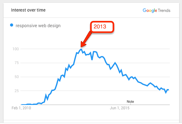
As shown in the below chart, the term Responsive Web Design experienced a meteoric rise between 2010 – 2013
The Problem With Responsive Websites Today
The issue with trends, is they tend to reach a point where people adopt them for the wrong reasons and/or just do not understand how to properly implement them. This causes the original intent to become devalued and lost in translation.
The mobile-friendly website is the new normal, and it’s never been easier to create one. However, just because a site is mobile friendly, doesn’t mean the user experience and interface design is optimized to meet user’s needs on a mobile device.
Back in the year 2000, when Allsopp was dreaming of harmony in web design, you had to hire a designer and/or developer to build a site for you. There was no Wix, Go Daddy, WordPress or Shopify.
Today, just about anyone can build a simple website on their own, or pay a minimal fee to have one ‘designed’ for them. There are millions of web templates on the market, and nearly all of them are ‘responsive’.
The templatization of website design is a topic for another article, but as it relates to responsive web design, here’s the challenge…
All-purpose web templates are being created as catch-all solutions that can be used for any business, in any industry. These templates are often created with blinders on, and aren’t built for a specific client. This means the needs of a single business or brand, and its direct users, are not being factored into the creation of the end design.
Check out a generic responsive WordPress template, for example, and you’ll see some major discord when it comes to creating the ‘harmony’ necessary for a true mobile-friendly experience. The mobile view will often stack all content and squeeze down images, text and buttons to illegible sizes and proportions. To make things worse, resource intensive assets and code are often not properly optimized for mobile, meaning crucial considerations like page load time and user experience are left to the wayside.
Do you see the problem here? The desires of people like Allsopp and Marcotte were for websites to adapt to the needs of specific people. The Interactive Architecture movement was designed to combat the pre-fab designs of yesteryear, which locked users into a generic environment that wasn’t intended to address their specific needs.
What People Really Want From a Website (It’s Not Responsiveness)
Our industry often forgets that the layperson will often have never heard of the term ‘responsive design’, and doesn’t know what a media query or fluid grid is. We get wrapped up in the jargon and the buzzwords, and lose track of the result we should really be striving for.
Users don’t care if your site is responsive, they simply want a great user experience. Call your site responsive, adaptive, mobile friendly, device agnostic, or any fancy buzzword you like, but if it’s not fast, engaging and driving conversions, it’s not doing its job.
Here are some examples…
If a mobile site re-uses interactive elements built for desktop that do not work on mobile browsers, it’s not doing its job.
If a mobile site for a local business doesn’t have contact info like phone number, hours and locations front and center, it’s not doing its job.
If a large ecommerce website doesn’t offer a quick way to drill down into product categories from the mobile homescreen, it’s not doing its job.
If a mobile phone homepage has a rotating banner with 10 slides, each with tiny text and buttons so small you can’t click them, it’s not doing its job.
If a mobile site has heavy video files or images that will not load, its not doing its job.
I could go on and on, but you get the point. It’s not about ‘being responsive’, it’s about serving content that makes sense visually, is designed for mobile, loads quickly and makes it easy for people to perform tasks or consume information. Achieving this often requires a blend of content strategy, mobile-first thinking and adaptive design (showing, hiding or re-designing content sections for mobile).
The Answer: Be Responsibly Responsive
The key to building a great responsive website is to be ‘responsibly responsive. Create a content strategy per device that lays out the hierarchy of content. This will ensure you only serve what’s necessary, and in a format that will be legible and easy to consume or interact with.
Often, a ‘mobile first’ design approach is required to prevent the “squeeze”, as I like to call it’, or blindly stacking all desktop content into a long scroll on a phone. Often there are sections you’ll want to hide or re-design for mobile. Check out large retail sites on mobile and you’ll see they sometimes look completely different than their desktop counterparts. This is because big brands understand their consumer and know how people use their mobile websites. They are putting people and user experience first, and that’s a strategy you can’t go wrong with.
Also consider page load time and know your users will be accessing your site from wifi connections or mobile networks with varying degrees of quality and speed. The ‘progressive enhancement’ technique, or loading mobile content in a pre-planned manner to ensure fast load times for all users, is appropriate for sites with lots of video and image content, for example.
Wrapping Up
The moral of this story is we should always be thinking user-first when designing a website. Put yourself in the shoes of the user, and ask yourself what you would want or need from the site you are building. Forget about being ‘responsive’ as the end goal, and focus on usability. This philosophy will allow you to create harmony among devices, browsers and ultimately, humans.
©2024 FUZE DIGITAL INC. Ignite Your Brand™ | privacy


