
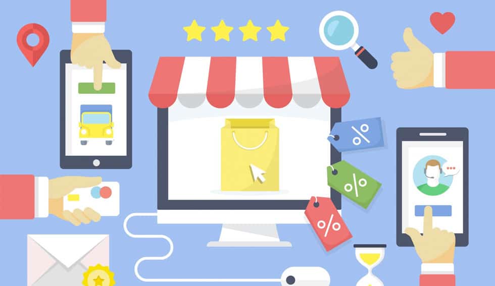
Ecommerce conversion optimization requires dedication and attention to detail and, if properly executed, can result in dramatic lifts in engagement and sales.
Don’t know where to start? No worries.
We’ve gathered 50 of our favorite conversion optimization tips that are sure to give your sales a lift.
1. Optimize for mobile devices
This is a no brainer, but if your site isn’t mobile-friendly, you’re in for an uphill climb. Combine Google’s Mobile Friendly update with user’s increasing expectations for sites viewed on mobile devices to perform as well as on desktop, and you’ve got zero excuses for not going mobile.
2. Improve navigation
Site navigation sets the tone for good user experience. Often, navigation menus are created on a whim, without giving much thought to what structure and design will lead to more sales.
Tips:
- Based on analytical data, place your top performing pages further to the left in the main menu.
- Leave pages that receive little traffic or engagement out of the main menu, and consider pushing to a super-navigation or footer.
3. Add phone number
Your customers value transparency and should be able to call you with any pre or post-sale questions or concerns. Place your main customer support or sales number in the header, and make it click-to-call on mobile phones.
4. Add live chat
The immediacy of live chat is very attractive for customers who need quick support and would rather type than talk. Also, considering many online purchases are make during the working day, it allows people communicate with you quietly and discreetly.
5. Add FAQ
One of the most effective ways to avoid to pesky pre-sales calls and emails, and minimize post-sale issues, is to add your most frequently asked questions to a dedicated FAQ page.
Tip:
- Make a list of the most common questions customers have about your products and services, and write clear and concise answers that aim to alleviate any doubt. This will boost consumer confidence by showing that you’re transparent and have nothing to hide.
6. Add Cookies Policy
Just about every website these days collects customer data via cookies. By creating a cookies policy and linking to it in your footer, you’ll eliminate the chances of customers accusing you of snooping on them. Once again, transparency is the best policy.
7. Add or Improve Return Policy
If you have a return policy, make sure it’s crystal clear and sets proper expectations. If you don’t have one, shame on you! You’ll hear this word a thousand times in this list, but transparency is a win-win for everyone.
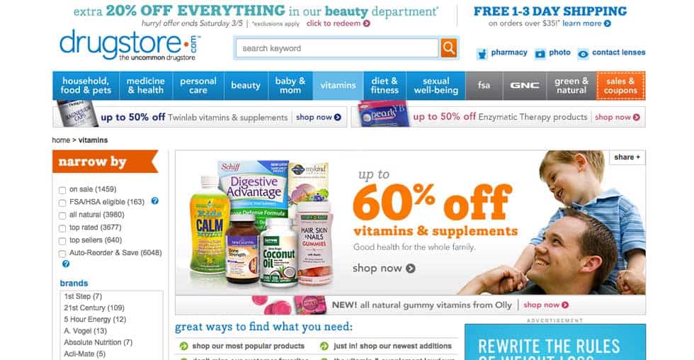
8. Ditch Your Banner Carousel
There is now enough evidence to say with full confidence that static banners convert better than rotating carousels. Information overload causes fatigue and greatly reduces the chances of driving click-throughs.
Recent studies show that only 1-8% of users click on any slide within a banner carousel, and that click through rate is highest for the first slide and decreases for each subsequent slide in a given sequence.
9. Revamp color scheme
Colors are powerful design elements known to evoke specific emotions and perceptions.
You don’t have to revamp your overarching brand guidelines in order to experiment with which colors drive more conversions. Start with a few simple tests, such as changing main Call-to-Action buttons to another color, and measure the results.
10. Optimize call-to-action buttons
Call-to-Action buttons are the primary conversion drivers on any lead gen or ecommerce website. Every transaction online is driven by a user clicking some sort of button, whether “Request a Quote”, “Contact Us”, “Start Free Trial” or “Buy Now”.
Tips:
- Experiment with variations in button text: Request a Quote vs Free Estimate, for example. Make all CTA buttons the same color, and ensure it’s a color not used anywhere else in the design. This will drive user’s eyes to the buttons and alleviate any visual conflicts.
- Never place multiple CTA buttons in close proximity. The burden of too much choice can result in inaction.
11. Add an opt-in CTA or pop-up
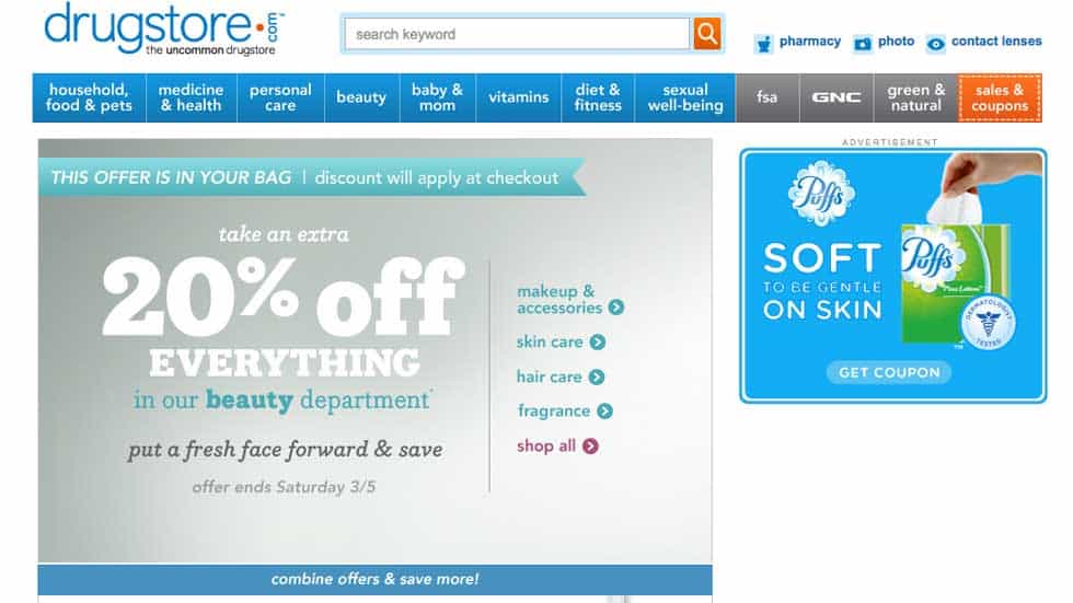
While asking too soon for an email address was once taboo, it’s now the norm. Just about every online store hits you with a pop-up when you land on the site, offering a discount in exchange for your email address.
The key to a successful opt-in pop-up, is offering something of value, like a discount for first-time shoppers. Generic text like “Sign up to receive updates” will not work, especially if your brand isn’t well known.
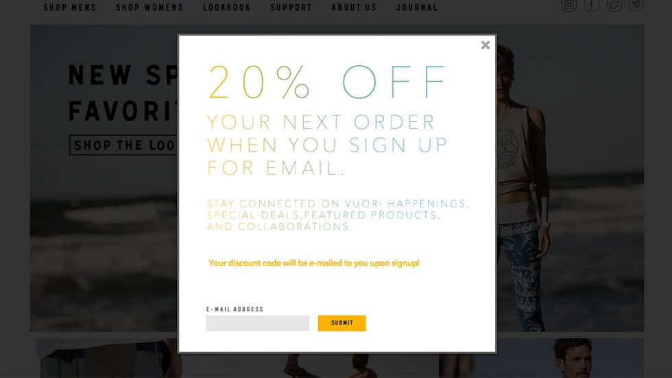
The opt-in pop-up will drive conversions in two ways:
- 1) offering a discount to new visitors encourages them to give your brand a try.
- 2) you’ll be able to use the emails for future email marketing campaigns.
12. Add newsletter sign-up form
Since you’ll only want to serve your opt-in pop-up to first time visitors, you want to provide a second chance for those who didn’t opt-in. Add a newsletter signup to your footer or sidebar to ensure visitors can sign up at any time.
13. Remove social sharing tools from product pages
We wrote a post dedicated to this topic, but in case you missed it, there is proof that social sharing tools/icons on product pages can actually hinder sales. Why? They clutter up the page and give users more choices, instead of keeping them focused on checking out.
14. Improve site speed
Sites with pages that load quickly have been known to see higher conversion rates and better Google rankings. While Google has yet to declare that Page Load Speed is a ranking signal, there’s still plenty of evidence to support the theory that faster sites perform better.
15. Improve site photography
Images on a website can have psychological impacts that sway conversion rates. If your site is full of business people shaking hands or pixelated images you stole from Google image search, you’re most likely not putting your best face forward.
Strategic image selection can be used to nudge users down the conversion funnel. For example, an image of a person looking at, or pointing to, a call-to-action button, may perform better than if the person is looking the opposite way. Or, smiling and happy people may convert better than serious looking ones.
Tips:
- Hire a photographer to take pictures of your team, office or products, and use them on your site.
- Develop a content strategy that considers who site photography plays a role in user experience.
- Consider how your images can be used to tell a story, evoke an emotion or guide users towards your end goal.
- Run A-B tests to determine what type of images work best for you.
16. Add or remove iconography
Often, purely informational sites with a lot of copy can be brought to life by adding iconography that serves two purposes: a) wayfinding and b) visual enhancement. The key is using icons only when necessary, meaning when it helps your users navigate or make decisions.
On the other hand, overuse or haphazard use of iconography can have the opposite effect, causing clutter and confusion.
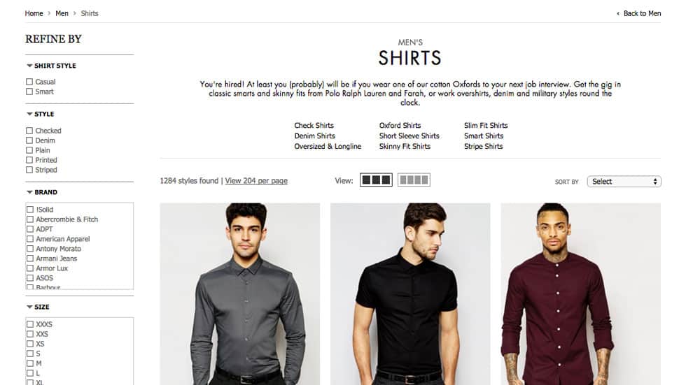
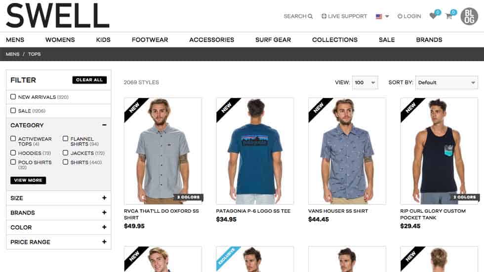
17. Improve or add filters and sorting options
For sites like ecommerce stores with categories, sub-categories and lots of products, it’s important to make it easy and efficient for users to find what they are looking for.
Filtering is typically a means to drill down into a parent category to find items that have certain attributes. For example, a site selling men’s shirts should allow filtering by long sleeve, short sleeve, dress, casual, etc. a site selling shoes may allow filtering by athletic, dress, training or casual.
Sorting is generally a way to re-order results on a page based on things like Price, New Arrivals or Most Popular.
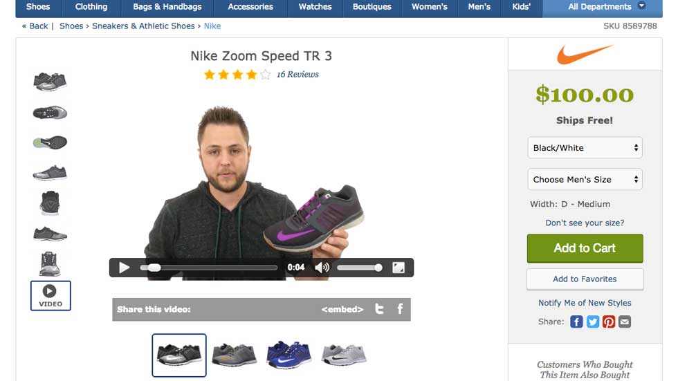
18. Add video
Video has become one of the most powerful selling tools on the planet and, if well-executed, can be used to entertain, explain, inform and educate. It can also be served on any device and on any platform, making it a highly versatile way to connect with your audience.
Video can also be used in many ways to improve conversion rates. It all depends on the nature of your company, and who your target audience is.
A few good examples are:
- Zappos’ use of product videos, which highlight selling points while demonstrated how each item looks on a live model.
- Geek Squad’s YouTube channel, which features do-it-yourself tutorials for solving technical problems. As a rule of thumb, videos that are utilitarian in nature are bound to drive more ROI.
19. Improve product descriptions
It’s always amazing to see how many business try to sell products online without providing much information about what they are selling. Ever ask yourself why sites like Amazon and Best Buy drive so much revenue? Take a look at their product pages and you’ll find out.
Both brands are known for incredibly detailed product pages that include everything you would possibly want to know before making a decision. Thorough descriptions, extensive photo galleries, technical specifications, shipping and return information, warranty details, customer reviews and more, all lead to transparency and trust, which are critical components of driving conversions.
20. Add video testimonials
Written testimonials are a thing of the past. Everyone knows that most companies make them up, so they are largely ignored. However, videos of real customers divulging their real-life experiences can have a powerful impacts.
21. Add photos or videos of your office or facilities
If you’re not a big brand with an established reputation, you need to give consumers every reason to trust you. One great way to build credibility is by showing users you’re real and legit by featuring photos or videos of your office or facility.

22. Improve your contact page
If you want people to contact you, and consider it an important part of your sales strategy, you need to invest some time into optimizing your contact page.
At a minimum, every contact page should have the following elements:
- NAP information (Name, Address, Phone Number)
- A Google Map (for local SEO and usability)
- Important email addresses
- A well-optimized contact form
- A separate “Thank You” page that loads after the form is submitted.
23. Optimize your lead gen forms
It’s not enough to just have a contact form. The design, layout and functionality of your form will play a huge role in driving conversions.
Tips for designing a high-converting contact form:
- Include in-line field validation for email address
- Denote which fields are required and highlight fields that haven’t been completed.
- Place form labels directly above the fields (not to the left)
- Add hints inside each field for Name, Email, Message, etc.
- Use 3-5 fields maximum.
- Add, when appropriate, radio buttons or a dropdown so users can tell you what they need help with (Support, Sales, Partnerships, etc.).
24. Refresh your branding
The way people perceive your brand online is paramount to driving customer acquisition, so it’s important to ensure it resonates with your current demographic.
Walmart, Olive Garden, Marriot, Visa and Black and Decker are examples of companies that recently gave their branding an overhaul, in an attempt to appeal to a new generation of consumers and modernize their appeal.
The common thread among all of these examples is the trend to go with a “flat design” scheme that ditches drop shadows and fancy effects for a simple and clean aesthetic that’s very aligned with current trends in web and graphic design.
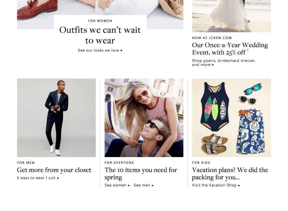
25. Streamline user pathways
Users should be able to identify within a few seconds of landing on your site where they need to go to find what they need. This can be achieved by establishing clear user pathways.
Examples of user pathways:
- A university website with Homepage pathways for Prospective Students vs Existing Students
- An online clothing store with pathways for Men, Women and Children
- An ecommerce website with options to view New, Featured and Sale products.
- An apparel company with products grouped by theme, such as Beach, Office, Night Out and Wedding.
- A SaaS product offering products for Single Users vs Enterprise
26. Optimize Check-out Page
Your checkout page is the holy grail of ecommerce and one that’s poorly designed can crush your profit. The key to creating a killer checkout page, is keeping it as simple, organized and bug-free as possible. If you make people fill out a three-page form only to learn upon clicking “Checkout” that their browser has frozen, it won’t exactly boost confidence.
Tips for a high-converting checkout page:
- Implement a progress bar to indicate how many steps are involved and where the user is in the process.
- Allow users to select “Billing same as shipping” so they avoid re-typing the same details twice.
- Give the option of creating an account at the very end of the process by providing an email and password field. You already have their name from the previous Billing and Shipping fields, so make it easy to create an account.
- Ensure your checkout page is bug-free and doesn’t crash when the final “Place Order” button is clicked.
- Set up friendly and informative order confirmation pages, so users know what to expect next.
- Create an order confirmation email that includes order details, tracking info and customer service contact info.
27. Optimize Category Page Layouts
Well-designed category pages can enhance user experience and increase click-throughs by streamlining the process of finding individual products within large catalogs.
There are a few standard features that successful online stores use to beef up user experience:
- Grid of hi-res product hero images
- Product title, price and sale price (if applicable)
- Quick View for seeing product description, thumbnals, etc.
- Available colorways (color swatches or images)
- Filtering and sorting tools
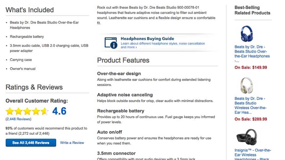
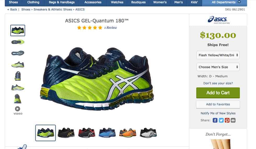
28. Optimize Product Page Layouts
Aside from the Checkout Page, the Product Detail Page is perhaps the second most important page on an ecommerce website. Since online shoppers don’t have the luxury of touching and seeing products in person, they need to be given enough information to make informed purchasing decisions.
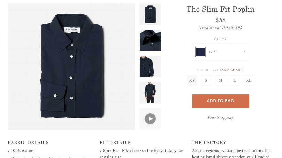
Tips on creating product detail pages that inspire confidence:
- Provide multiple hi-res product images at different angles and zoom levels.
- For clothing, shoes, jewelry, etc., show multiple on-model images, as well as flat shots as needed.
- Include product videos
- Include 360 product photography
- Provide thorough descriptions that include notes on what makes products unique.
- Provide notes about shipping, returns, warranties, etc.
- Include size guided
- Include product reviews
- Include product-specific FAQs
29. Add breadcrumb navigation
For large ecommerce websites, it’s always a good idea to give users a path to navigate back to previously viewed category and sub-category pages. If visitors get lost, they will often bounce and may not return, so giving them a way to trace their footsteps can help eliminate any disorientation.
30. Improve browser “back” button behavior
Many ecommerce sites allow you to display up to 100 products on a given page. This means when you’re scrolling through the list and clicking on products, you should always be able to navigate backwards without losing track of where on the category page you left off.
There’s nothing worse than being sent back to the very top of a category page and being forced to re-scroll through results. It makes for poor user experience and is a sure fire way to annoy would-be shoppers.
31. Add product reviews
Many business owners are scared to death of online reviews, fearing that any negative feedback will kill sales. However, product reviews actually have many positive impacts on your business, and your website.
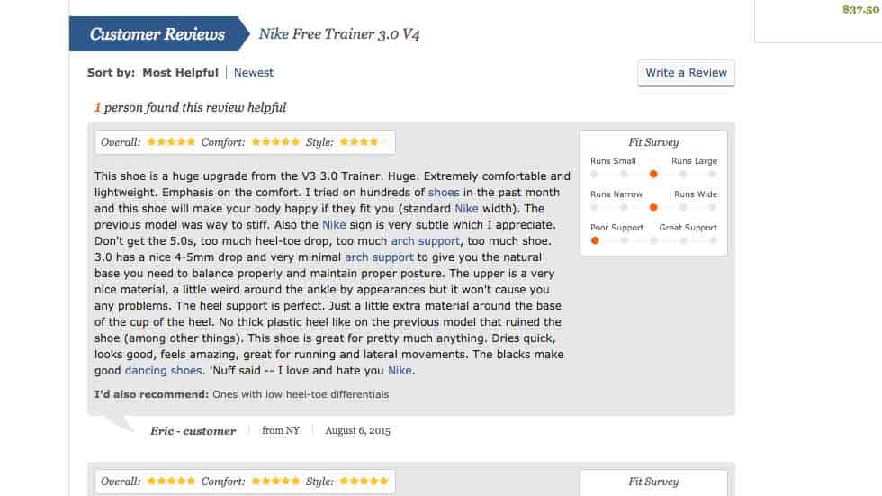
Why you should add reviews:
- They increase transparency, which is known to build trust.
- They provide real-world feedback from users who have experienced your products. This can build consumer confidence.
- Google loves sites that drive audience engagement, and reviews are living, breathing elements that signal page freshness and user interaction.
- Negative reviews can be used to improve upon your products and learn what features or attributes your customers are unhappy with.
32. Add Recently Viewed Products
Online shoppers will often bounce from product to product without saving anything to their wishlist or shopping cart, and may not have the stamina to re-find an item that caught their eye.
Adding a recently viewed product block to your site provides one-click access to the most recent items a user has seen, thus increasing the likelihood of re-engagement.
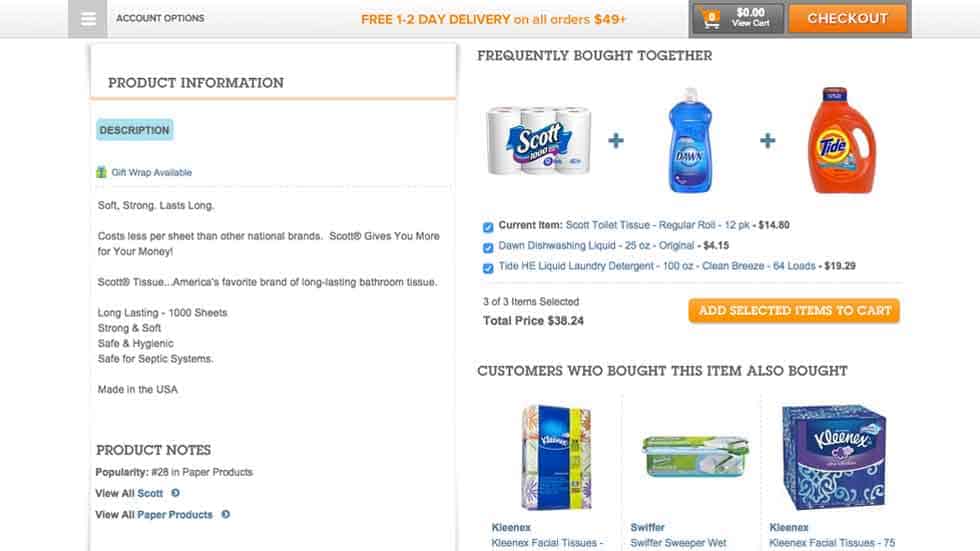
33. Add Suggested Products
Adding a suggested or recommended products block serves two main functions:
- It offers alternatives to the product being viewed (similar styles, makes, models, etc.)
- It allows you to recommend add-ons or supplemental items, which can increase Average Order Value (AOV). An example is Amazon’s “Users Also Bought” and their bundling promos that give users discounts for purchasing a set of items that are in a similar category.
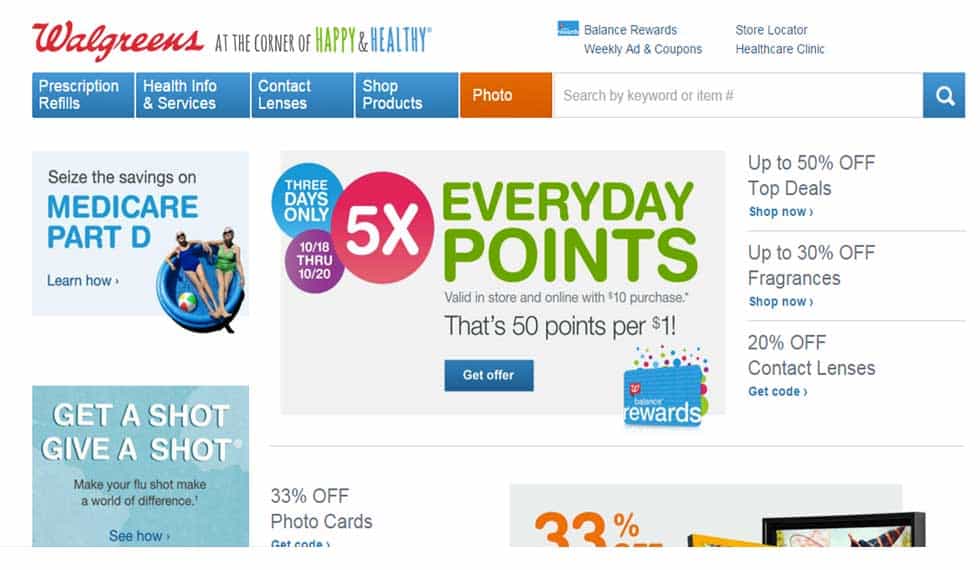
34. Offer free or discounted shipping
The biggest and most successful retailers take shipping quite seriously. Ever notice that major players like Jcrew.com, Soap.com and Macys.com always tout their latest shipping promos in the header of their homepage?
Shipping is expensive, and customers will often shop around to find the cheapest option. It’s a shame to lose a potential life-long customer on a one-time shipping charge, so come up with an attractive shipping offer and highlight it above the fold where visitors won’t miss it.
Shipping promo examples:
- Free shipping on orders over $99
- Free shipping on orders over $150, or $5 flat-rate shipping
- Free 1-2 day delivery on orders over $50
35. Offer promo codes
This really needs no explanation, but online shoppers love discounts. In fact, it’s often one of the only reasons they shop online.
Make sure you always have an attractive promo running, and make the promo and discount code highly visible on your website.
36. Run seasonal sales
Like promos, seasonal sales are another massive driver of online conversions. Many online retailers have a dedicated Sale section for shoppers who only buy discounted items. Others promote sale items right on the product grid by crossing out the retail price and highlighting the sale price in a color such as red.
37. Promote a Lifestyle, not just products
Many brands are opting for the content-meets-commerce model, which combines elements of editorial and retail site design. The end goal is to create a lifestyle brand that draws users in with inspirational and/or aspirational content, while inconspicuously nudging users down the conversion funnel.
A brilliant example of this is Jcrew. Their latest Homepage presents an editorial layout that uses what looks like blog posts to point users to specific category pages that feature related products.
38. Add a loyalty rewards program
Lifetime customer value is everything when it comes to growing a lasting retail brand that stands the test of time. A great way to keep customers around for more than one or two purchases, is by rewarding them for their loyalty.
Customer loyalty programs come in many flavors, but it’s best to keep it simple and give shippers a reason to keep coming back. A common implementation is a system where users accrue points that can be redeemed for discounts on future purchases.
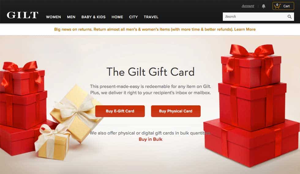
39. Sell gift cards
The exciting aspect of offering gift cards to your customers, is it encourages your loyalists to spread the word about your brand, which increases awareness and can lead to those receiving cards making future purchases.
There are several reputable companies offering gift cards that can be bought physically, or digitally, and cross over for use in-person, or online.
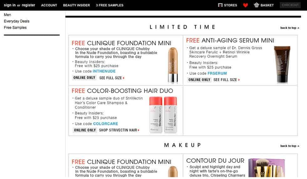
40. Offer free gifts
Free stuff is always a good way to encourage sales. Sure, free gifts can be cheesy, but that’s why you can’t just give away anything.
Sephora.com has a long-standing history of giving away free products online; however, the catch is, they give away small samples of other products they carry in-store or online, which encourages follow-up purchases of larger sizes of the sample items.
41. Improve transactional emails
Ordering online can be stressful, and rightfully so. There’s an inherent level of anxiety that comes with ordering blindly, giving up your personal and credit card info and waiting patiently for someone to tell you when your order will arrive.
Much of the post-purchase anxiety can be relieved by ensuring you’re communicating with customers every step of the way.
This can be easily accomplished by creating a set of transactional emails that are automatically sent when the following things happen:
- Order is placed
- Order is cancelled
- Shipment has been sent out
- Refund has been processed
- Customer account has been created
- Customer account has been deleted
42. Allow customers to track shipments
This ties into the overarching theme of building trust and consumer confidence. No shopper enjoys sitting around hoping and wishing their order will arrive…someday. Most popular ecommerce CMS platforms allow for integrating with major carriers (e.g. USPS, UPS, FedEx, etc.) so you can provide real-time tracking to customers.
How tracking helps your online business:
- It minimizes calls and emails from customers, asking for delivery status.
- It gives customers peace of mind in knowing exactly when to expect their items.
43. Offer discounts to repeat buyers
Your loyal customers need to be rewarded to show appreciation for their commitment to your brand. A bit of altruism goes a long way, so create an email blast with promos and discounts for your repeat customers, and watch their loyalty grow even higher.
44. Offer out-of-stock alerts
Often, a customer is looking for just one item, and if it’s out of stock, they may buy from someone else and never return to your website. This can be mitigated by offering the ability to sign up for back-in-stock alerts, where customers are automatically emailed once your inventory has been replenished.
45.Add color switcher to product pages
Product pages should make it easy for users to view all possible color combinations for your products. A great feature to consider adding, is a color-switcher that allows users to click on small swatches or thumbnail images to see images of products in all available colorways.
Many sites do not have this functionality, and instead represent colorways as separate product, each with their own product detail pages. The issue here is users then need to click back and forth between the category page and product detail pages to see what items look like in different colors.
46. Optimize your site for mobile devices
Since mobile commerce is still on the rise and not predicted to slow down anytime soon, it’s critical to provide an optimal shopping experience on tablets and mobile phones.
Since ecommerce sites are often content-heavy and require that users make numerous choices while browsing, your mobile user experience needs to be clean and efficient in order to drive sales.
Tips for mobile optimization:
- For larger sites, consider leading the Homepage with a menu of popular categories or pages, instead of a mirror image of the desktop version, which may lead with a hero/banner image.
- Make sure your banner image (if present on mobile) and associated text are not shrunken to the point of illegibility.
- Make sure all clickable elements (buttons, filtering/sorting options, etc. are large sized for easy usage)
- Make sure all forms are easy to navigation and complete.
- Consider how products are displayed on category pages on mobile (grid small thumbnails vs stacked images)
47. Optimize caching for your shopping cart
Online shoppers will commonly add items to a shopping cart, only to leave a website without making a purchase. Often, they will close their browser window and return at a later date to continue shopping.
Make sure your caching system does not clear user’s shopping carts too early, otherwise, you’ll risk losing a lot of potential sales. I’ve seen sites set to store items in carts for several months, or even up to one year.
48. Add or Improve About Us page
If your brand has an interesting story to tell, create a compelling About page that illustrates your history, heritage, values and vision. Telling brand stories creates emotional and memorable connections to customers, which can contribute to increased loyalty and long-term value.
49. Add or Improve Team page
Perhaps your brand story isn’t all that compelling, but your founders or team members are. It’s never a bad idea to create a team page with bios and links to social profiles of the people who run your company. Giving a face to a company is another way to make personal connections with customers.

Conclusion:
Ecommerce conversion optimization is a broad topic and there are literally hundreds of things you can do to improve. Take it one step at a time, and start with items that can be done quickly and cost effectively.
What are your top suggestions? Anything to add to our list? We’d love to hear from you in the comments section.
©2024 FUZE DIGITAL INC. Ignite Your Brand™ | privacy


![]()