
Online shopping can be fun and convenient, but only when retailers make it easy for us to find what we are looking for. More times than not, consumers hit roadblocks that make them think twice about purchasing. For example, would you buy a $1,500 sofa based on a limited product description and a single photo? Probably not. However, what if you were presented with multiple images and videos, extensive product specifications, as well as the ability to chat online with a sales associate?
Today we’ll compare the websites of two home decor giants, West Elm and CB2. Although both companies have experienced tremendous growth via clever branding and eye-catching products, their websites were not created equally. While both sites are clean, modern and user-friendly, a closer look reveals that one retailer shines when it comes to offering shoppers a robust set of tools that facilitates trust and transparency.
The Battle: West Elm vs CB2
To determine which website comes out on top, we analyzed best practices for ecommerce sites, which entails offering a user experience that leads to ease of navigation and an informed decision making process. If people A) can’t find what they are looking for or B) don’t know what they are getting, they are bound to shop elsewhere.
Where West Elm Shines
Sales promotions on Homepage
Showing all current sales promotions on the Homepage well above the fold is a great way to entice users to view the promotions and begin shopping. This is a crucial feature for price conscious consumers hunting for a deal.
Link to Store Locations in Header
West Elm and CB2 have physical store locations across the country. Many use their websites to window shop, but hold off on purchasing until they see items in person. Making it easy for people to locate the nearest store is a practice that all ecommerce retailers should follow.
Dropdown Menus
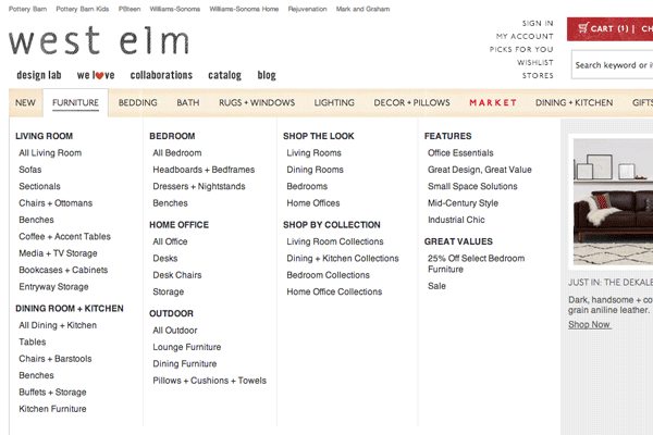
An extremely practical method of helping users find what what are looking for, is to provide dropdown menus from the main navigation bar that highlight all main categories in the online store. This type of menu is often referred to as a “mega menu”, and facilitates organization by setting up user pathways that guide users through the site.
Organization of Category Pages
West Elm’s main Category pages (e.g. Furniture) are organized by Subcategory (e.g. Living Room or Dining), and provide a visual structure that makes finding what you need a breeze. Clear hierarchy and logical user pathways are incredibly important for ecommerce websites with extensive inventories.
Comprehensive Filtering Options
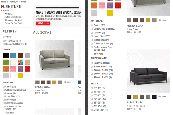
Sites with a lot of inventory and multiple product variations needs to assist users by giving them a way to narrow down their options. The easiest method is to offer a robust set of filtering tools for attributes like color, size, material and price range.
Quick Look feature on Subcategory pages
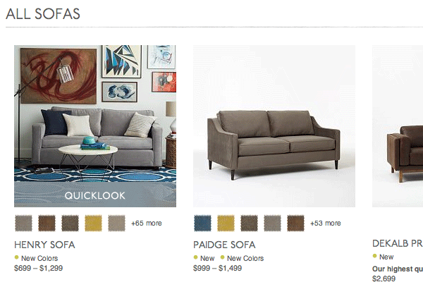
All items displayed on Subcategory pages have a “Quick Look” feature that allows users to view enlarged photos and essential product details in a pop-up window. This prevents the need to go back and forth from product detail pages to subcategory pages, making the shopping experience more seamless.
Product Videos
The inclusion of polished product videos ensures that visitors have the opportunity to see products up close and from every angle. The videos also add an element of emotion that further connects people to the products.
Extensive product info
The level of detail offered for each product is extensive enough that consumers can immediately gather vital information such as dimensions, packaging, care and shipping. Product info is organized into convenient pop-open menus that open and close for ease of navigation.
Great product photos, including multiple in-room views
Some products, such as sofas, have as many as 14 images. Items are often shown both on a white background and in a room setting, which allows shoppers to visualize them in a variety of ways.
Powerful set of customer resources and tools
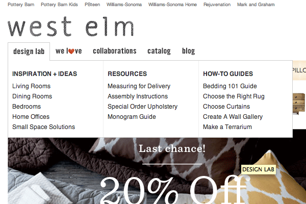
West Elm has created an impressive collection of tools that fall outside of the online store. Inspiration & Ideas, Resources and How-to Guides provide valuable content for visitors to consume, share and use for their home decor planning needs. This is important for several reasons:
Firstly, it provides a way to keep users on the site and have them coming back even when they aren’t in shopping mode. Secondly, it is a clever way to subconsciously get consumers excited about doing more shopping. For example, a beautiful gallery of inspirational room decor, may convince a casual browser to head to the online store to check out available options.
Where CB2 Gets it Right
Phone number in header
It is always a wise decision to include a phone number in the header. This will allow users to easily call customer support at any time during their visit.
Live chat
Live chat is a proven way to offer personalized support that can’t otherwise be replicated online. Often times, users feel more comfortable and confident speaking to a human. Even the most detailed FAQ page can’t combat this essential consumer tendency.
Customer reviews
Recent studies indicate that over 75% of people trust online reviews. For many, hearing what their peers have to say about a product will sway their decision in one direction or another, because it offers transparency and removes the glossy veil created by clever advertising and promotions.
The Winner: West Elm
West Elm’s website, while missing a few important elements, is the hands-down winner of this battle. WestElm.com offers a better user experience, including highly organize category and product pages and robust resources and tools that make shopping fun and easy.
If you own or maintain an online store, this article will shed light on what ecommerce sites need to boost effectiveness and drive sales. Products do not sell themselves, no matter how spectacular. When it comes to doing business online, assume that each user needs hand-holding in order to make it to checkout. Give them everything they need to alleviate common fears and allow them to shop with confidence.
©2024 FUZE DIGITAL INC. Ignite Your Brand™ | privacy


![]()