
Many marketers focus all of their energy on generating clicks, but getting users to click on ads or links is only half the battle. The holy grail of digital advertising is conversions, and they happen on well optimized landing pages that build trust and communicate value.
Landing page design is a science and pages must be carefully executed and tested in order to achieve optimal conversion rates. Today we’ll explore best practices for creating landing pages that turn clicks into customers.
8 Elements of a Successful Landing Page
1. Creating Relevance
The most important overarching factor is creating relevance between ads or links and target URLs. A click is an initial vote of confidence, so sending someone to an irrelevant page with unrelated content is a sure way to quickly lose trust.
Relevance becomes most important for Pay-Per-Click advertising. A major factor in ad placement for Google AdWords is “Quality Score”, which is a 1-10 scale of how closely a landing page’s content relates to the refering search advertisement. For example, if a user searches for “pink polo shirts”, it would be ideal to show them an ad for “pink polo shirts”, which directs them to a landing page about “pink polo shirts”.
2. High Quality Copywriting
It is extremely important to spend ample time crafting a content strategy, and implementing well-written messages, taglines and descriptive copy. There’s no need to write a novel (users won’t read it), but you do need to succintly and convincingly outline the benefits of your product or service. Typos or grammatical blunders are not acceptable, so have several sets of eyeballs assist with proofreading and copy editing before pushing your pages live.
3. Clear messaging
You have just seconds to convince a visitor they are in the right place and you have what they are looking for. Clear, concise messaging well above the fold can be used to communicate the nature of a page’s content. Briefly describe what you’re offering and use the keywords that appeared in your ad to create strong relevance and a mental connection.
Users will not read long sentences or paragraphs, so be brief. It’s also important to find the right balance of text size, color and placement, to ensure your copy is legible and stands out.
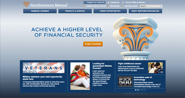
In the below example, Northwest Mutual fails at providing users with a clear picture of what is being offered. The phrase “Achieve a higher level of financial security” is extremely vague. Does this banner image relate to the brand as a whole, or a particular product? What do they want you to “Get Started” with? An application? Speaking to a customer service rep? Reading about their products or services? Also, the column image is very generic and does not connect people with the brand. It’s impersonal, overused and devoid of feeling.
4. Calls to action
User pathways are vital to driving conversions. Bold calls-to-action should be used to tell visitors what their next step should be. For example, a “Register Now” button or piece of text prompting a form completion or phone call are examples of common CTA’s.
A best practice for buttons or links is to make them bright, bold colors in order to draw visual attention. It’s usually best to select colors that are not used elsewhere. This will ensure your CTA’s are seen as unique instances and don’t get lost on the page.
The below design uses three bold calls to action, all directing users to the form on the right-hand side of the page. This is a great example of using visual cues to guide consumers down the right path.
5. Trust builders
Breaking the trust barrier is often difficult, but consumer confidence can be greatly increased by providing trust-building elements that crumble the walls hesitancy. Examples of trust builders include client testimonials, before & after photos, product videos and certification badges.
Each business needs to determine what is most appropriate and provides the strongest indication of legitimacy. A party planning company, for example, can showcase beautiful event photos, while a plastic surgeon can highlight before and after images of real clients.
Consumers respond well to transparency. Give them reasons to trust you and conversions will come.
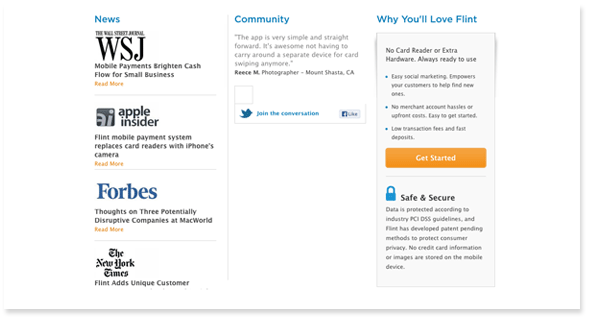
The below example is the bottom half of Flint.com’s landing page. Flint presents users with impressive news mentions, a customer testimonial, three value propositions and a “Safe & Secure” badge. Together, these elements create a sense of legitimacy and a feeling that this company knows what they are doing.
6. Organized layout with strong hierarchy
The transition from internet search, to ad click, to landing page arrival can often be disorienting. Your landing pages need to be designed with organization of content and visual hierarchy in mind, otherwise, confused visitors will quickly bounce.
First, pull together your page content (main messaging, calls to action and trust builders) and map out a visitor’s journey from search engine query to landing on your page. What mindset are they in? What action would you like them to take?
Here’s a suggested flow to get you started:
1. Disambiguation: tell users they are in the right place (main and supporting messaging)
2. Show Value: why should they choose you? (graphics, bullets, video, etc.)
3. Build trust: prove you’re legit (testimonials, before/after, badges, etc.)
4. Ask for the sale: call-to-action (button, phone number, form, etc.)
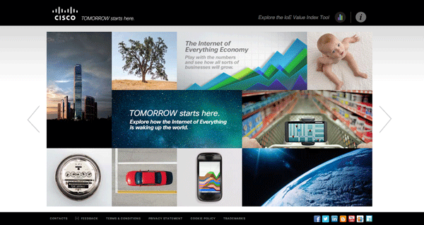
I was taken to the below Cisco landing page after clicking on a banner ad. My first reaction was “this is a disaster”.
What’s wrong?
The layout is cluttered, random and confusing. What does a baby have to do with a skyscraper? The copywriting is vague and poorly crafted. What is “The internet of everything economy?” There are no clear product descriptions, value propositions or calls to action. What is expected from the user?
7. Stand-alone page or association with your website?
Another important consideration is whether or not your landing page will be completely independent of your main website, or married to it (via a common navigation menu and/or footer). Often, marketers attempt to create a “trap”, where a single conversion opportunity is the only option. For example, if you want users to sign up for a free trial, you may want to present a single call-to-action button. This creates a straightforward task that is not only easy for users to make sense of, but also easier to track in analytics.
By presenting opportunities to leave the page (e.g. navigation menu shared with your main website), you run the risk of users becoming distracted from the task at hand.
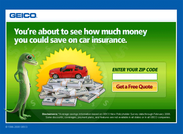
Geico makes it pretty simple. Enter your zip code and get a free quote, or leave the page. No additional options are provided and there are no linkages to the main Geico website via header or footer navigation menus. This is a cleverly designed and highly targeted marketing trap.
8. Tracking and testing
Last but not least, conversion tracking and A-B testing are incredibly important, as they allow you to improve return on investment by optimizing click-through and conversions rates.
Proper tracking can be implemented via Google Analytics with its built-in goal and conversion tracking system. By keeping a close eye on your visitor’s behavior, you’ll be able to collect valuable data related to which ads and keywords are converting at the highest rates, as well as information about your visitors.
Testing can be done by showing ‘A’ and ‘B’ versions of a page to different audiences, and seeing which converts better. The best method for A-B testing is to change one element at a time, to determine what modifications trigger the greatest impacts. For example, perhaps a “Free Trial” button converts better than “Sign Up Now”, or a form with 4 fields gets more completions than one with 6. You’ll never know until you test, and even a small percentage can make huge impacts. Most famously, Expedia once increased sales overnight by $12-million by eliminating a single confusing field from their checkout form.
Putting It All Together
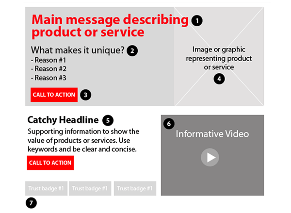
The below example illustrates a landing page design that utilizes everything we’ve covered today. While this should be considered as a generic “template” that certainly will not work in all cases, it should provide clarity regarding how critical elements can be arranged to inform users, show value and build trust.
Key elements:
1. Main message (the elevator pitch)
2. Differentiation factors or value propositions (what makes this product or service special?)
3. Call-to-Action (what do you want users to do next?)
4. Image or graphic (visual engagement)
5. Supporting information to build value (what do users need to know?)
6. Video to engage, inform and build trust (e.g. product demo)
7. Trust badges (could be press, awards, certifications)
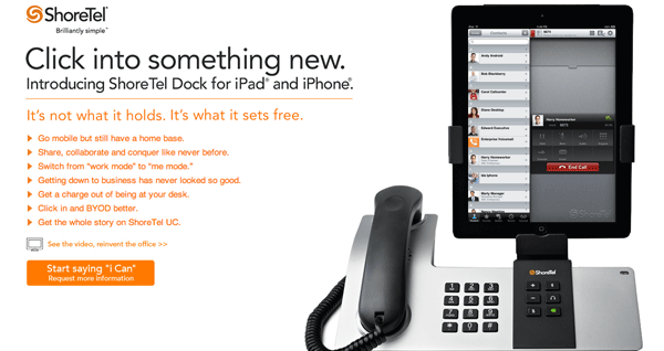
As shown below, ShoreTel does a pretty good job of providing everything described above. Users are presented with a branded tagline supported by a clear description of the product (dock for iPad and iPhone) and a bulleted list of value propositions. Supporting images and a link to a video demo allow users to become informed prior to making a decision. Finally, a bright orange button entices visitors to “Request more information”.
What’s missing?
Consumer confidence could be improved by providing a block of press mentions or trust symbols. Has this product been highly touted by a reputable tech or review website? Has it been featured in any noteworthy publications?
©2024 FUZE DIGITAL INC. Ignite Your Brand™ | privacy


![]()