
Going mobile is great, but only with proper planning and execution. The best way to design a mobile website is by starting small and scaling up. This practice, known as Mobile First Website Design, will ensure you deliver appropriate content and user experience to your audience.
The term Mobile First was coined in 2009 by internationally known digital product designer, Luke Wreblewski. Luke was a former Chief Design Architect at Yahoo! and Leader of User Interface Design at eBay, and now runs a consultancy called Ideation + Design.
The overarching premise of Mobile First Web Design is that by starting small you are forced to prioritize elements and weed out extraneous content that does not contribute to an optimal user experience. This is contrary to starting with a desktop layout and attempting to scale down the design to accommodate much smaller screens.
As we move deeper into the mobile age, it will become absolutely critical to create experiences that put users first and consider what they want and need in order to get things done.
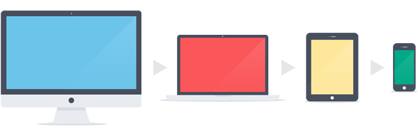
The Pitfalls of Desktop First (top-down) Design

The mobile revolution came much faster than many businesses, brands and consumers had imagined or even wanted. With little time to react and no precedent for best practices, the standard for creating a mobile experience became taking all of the content on a desktop site and squeezing it into a smaller container. This is now referred to as “top down” design.
It is now glaringly apparent that the desktop-first precedent will no longer suffice, as mobile users demand an entirely new set of requirements and tools, and consume content in a very different manner.
There are two major issues with the top-down approach:
1. Mobile users don’t need or want all of the information available on a desktop site. Consider an instance where you’ve pulled out your smartphone to search for a restaurant or other local business. There’s a high chance you were looking for a menu, phone number, hours of operation or location, and weren’t interested in reading about the history of the company or flipping through 20 rotating banner images.
2. People expect mobile sites to load quickly, and overloading a mobile site with content will slow down load times and reduce performance.
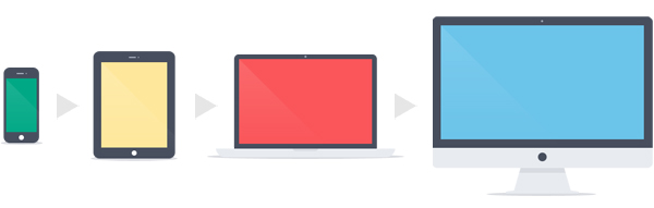
The Advantages of Mobile First (bottom-up) Design
The Mobile First approach allows you to design an experience that has the highest chance of helping your users find what they need. At the end of the day, most of your customers won’t care about your fancy Responsive Website or your long scroll page that goes on for days. What they really care about is getting stuff done!
Whether it’s purchasing a product, tracking down your phone number or finding your location, your mobile site should make it easy for users to find what they are looking for.
Always start by asking yourself these questions:
1) When users search for business like mine on their mobile devices, what information do they care about? What tasks are they most likely to perform and how do I offer the path of least resistence?
2) What content and/or features are not appropriate for a mobile device and are better served on a desktop site?
Once you’ve taken inventory of your highest priority items, you can begin to sketch out an interface design for the smallest devices you intend to target (typically smartphones).
If you’re designing a Responsive Website, you’ll want to map out mobile, tablet and desktop in parallel to ensure the experience is seamless and cohesive. One of the biggest mistakes in Responsive Design is not utilizing the ability to hide elements under certain widths. For example, hiding Homepage carousels on resolutions smaller than standard tablet screens is a good practice.
Now, Let’s Review What We’ve Covered Learned
1. Top-down design is bad.
2. Bottom-up, or Mobile First, design is good.
3. Always ask yourself what users want from a mobile experience and design for their needs.
4. Prioritize content to ensure you’re helping users get stuff done.
Need help optimizing your website for mobile? Contact us today to learn how we can help.
©2024 FUZE DIGITAL INC. Ignite Your Brand™ | privacy


