

Now that mobile Mobilegeddon is upon us, responsive website design has transformed overnight from a nice-to-have feature to an urgent necessity. The problem is, not all responsive designs are created equal. In fact, many of them suck.
Responsive website design (RWD) has only existed for several years, but has exploded into one of the most talked-about trends in web history.
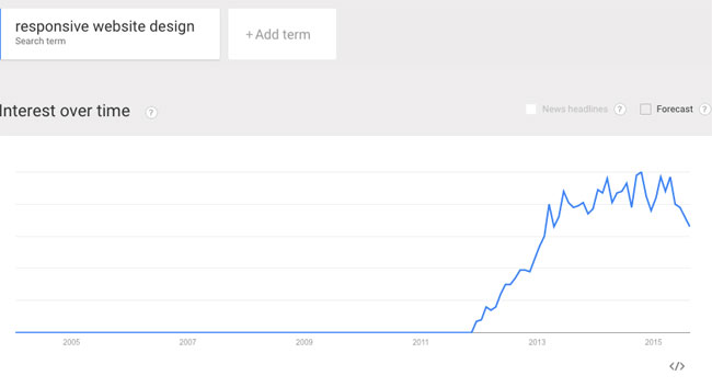
Interest Over Time for the search term “Responsive web design” from Google Trends
What started in early 2011 as a clever development technique for making sites adapt to multiple device types, is now a requirement for ensuring websites bode well with the Google gods. However, failure to properly plan your mobile site can cause engagement and conversions to plummet.
Let’s review some of the main reasons responsive website designs kill conversions.
1. Falling Victim to the RWD trend
Since the April 21st announcement that Google officially updated its search algorithm to include mobile-friendliness as a ranking signal, we’ve seen a massive swell in web consultants pushing mobile optimization services, and more clients requesting them.
The issue is, the term “responsive design” has morphed into a trendy buzzword, like eco-friendly or gluten-free. As with most trends, they have a tendency to become superficial and are often adopted without fully understanding the true origin or meaning. Anyone remember fashion models rocking flannel when Nirvana released the Nevermind album?
Before you dive into RWD, take time to understand where it came from, and how it can help your business. Do not blindly convert your site to responsive because you heard it’s the thing to do. This will spell disaster and the damage may be irreversible.
2. Standardization of website layouts
Every brand or business is unique, and requires a carefully planned strategy that considers how users will consume and interact with content, features and functionality. If your website does not meet the specific needs of your users, and doesn’t present them with a convenient path to getting what they need, your conversions will suffer.
As noted in a recent Smashing Magazine article, there seems to be a lack of unique ideas for web layouts. The article includes the below graphic, which illustrates the most common layouts, all of which feature grid-based interfaces commonly seen in RWD.
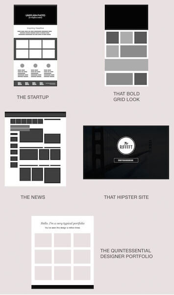
As you may notice, these layouts fall inline with many of the most popular responsive WordPress themes, many of which are built on Foundation and Bootstrap and include pre-defined design assets (typography, iconography) and page layouts (services, about, team, contact, etc.).
People who make websites now have a plethora of plug-and-play tools at their disposal, which is both a blessing and a curse. While it’s great that designing a website is more convenient than ever, reliance on these tools can limit creativity and end up hurting your brand, and your ability to convert.
3. Lack of a content strategy
The quick and easy method of making a site responsive, is stacking all content in a single vertical column. While this technically qualifies as a responsive layout, it may not qualify as a good mobile user experience.
We need to move away from the notion that just because your content can be squeezed into a smaller container, it’s a good design. The measure should always be engagement, which is driven by user experience.
A website may include a variety of content types that are used to drive users to convert. From plain text headings to call-to-action buttons to images, it’s necessary to map out an appropriate hierarchy that ensures your most enticing content is seen by users regardless of device type.
4. Lack of a mobile conversion strategy
Conversion strategy is directly tied to content strategy, and should be planned according to the main actions you want users to perform on your site.
Examples:
– If your main conversion is a form completion, don’t bury the form at the bottom of a page where users have to scroll for five minutes to find it.
– If you have dozens of categories for users to choose from, perhaps you’ll need a limited navigation menu on the mobile phone homescreen that promotes only your top categories.
– If your desktop layout has important user pathways below a full-screen banner image, perhaps you should remove the banner on mobile phones so the user pathways are at the very top of the page.
Some of these adjustments may be considered as Adaptive, as opposed to Responsive design techniques, and do require knowledge of media queries to show/hide elements per device. So, ensure you hire a developer with sound knowledge of these methodologies.
5. Lack of an appropriate mobile UX and UI design
True responsive design is an artform. It requires an understanding of spacial relationships, appropriate scaling for interactive elements like buttons, form fields, menus, dropdown selects, pop-ups, etc.
Good responsive design makes it easy for users to find and interactive with content and complete goals. The hard work you put into your content and conversions strategies will fail if the UX-UI is not well thought out.
One of the most common UX-UI mistakes, is scaling down content so much on mobile phones that is becomes illegible or difficult to interact with.
Examples of elements that should always remain at a usable scale:
– Text
– Text links
– Buttons
– Form Fields
– Dropdown Selects
-Radio Buttons
– Navigation Menu links
– File Download Icons
– Forward/Back Arrows
– Video Play icons
– Social Media icons
– Social Media sharing tools
UX purists will argue the correct (and only) way to create a responsive website is via mobile-first design, which starts with layouts for mobile devices before tackling desktop.
Reasons mobile-first contributes to high conversion rates:
– Forces you to focus on design and spacial relationship of content most critical to driving conversions.
– Ensures your mobile layouts include appropriately scaled elements, as mentioned above.
– Allows you to consider how complex features should be simplified for optimal usability on small screens.
In the simplest of terms, it’s easier to go from small to big than start with something complex and try to jam it all into a smaller container.
6. Reliance on pre-built templates
Due to the high costs associated with crafting all-out mobile-first experiences driven by full content and conversion strategies, the most common method of creating responsive websites is utilizing off-the-shelf themes or templates.
We’re seeing the same themes being recycled thousands of times, and often without being modified to meet client-specific needs. For example, Avada, the most downloaded WordPress theme on www.themeforest.net has been purchased over 139,000 times.
It would be amazing if a theme like Avada could drive conversions equally well for 139,000 websites from a wide range of industries; however, I have strong feeling that’s not the case.
Problems with 3rd party themes:
– Most templates are built for general use and are not crafted with any particular brand or audience in mind.
– Most templates attempt to be as all-inclusive as possible in an attempt to appeal to a wide audience. This means the top selling themes often contain virtually every website design trend and technique available: parallax effects, deep scroll pages, animated banners and icons, fancy page transition effects, massive font and icon libraries, page builders, etc.
Web trends should be implemented with purpose and reason, and used to enhance a brand’s identity and improve user experience.
– WordPress themes in particular often have heavy front-ends containing multiple CSS and Javascript files. This can lead to slow page slow times and hinder overall performance.
Themes that are loaded with heavy front-end code require hosting solutions optimized for WordPress. This can be more expensive than defacto options like GoDaddy and BlueHost, so many web consultants will not offer them to their clients.
– Third-party web templates are often riddled with bugs and have not been properly tested for compliance with current industry standards. Using a pre-built website to drive your business is a risky decision and can lead to more harm than good.
– Giving clients full control over layout and content may lead to changes being made that diminish a site’s ability to engage and convert.
7. Speed matters
Mobile users want a user experience comparable to what they get on desktop, and if you can’t provide that, you’re at risk of losing a lot of potential conversions.
As detailed in a compelling infographic published by KissMetrics:
– 30% of mobile users say they abandon sites that take more than 6-8 seconds to load.
– A 1% reduction in page response can result in a 7% drop in conversions.
– If an ecommerce website makes $100,000/day, a 1-second drop in page response could result in a loss of $2.5-million/year.
Tips for increasing mobile speed performance:
– Use Adaptive Image Compression to serve appropriately sized images depending on network conditions. This prevents a known issue in RWD where all available content is downloaded even when it’s not needed.
– Use server caching technology to store cacheable content in or near mobile carriers gateways.
– Use server technologies that provide real-time optimization such as reducing the number of HTTP requests, reducing the amount of data downloaded and speeding up rendering.
– Use server technologies that provide real-time TCP parameter tuning and HTTP pipelining.
8. Mobile-first doesn’t mean ignoring Desktop
Earlier this year, CNN unveiled a responsive redesign that caused quite a stir. According to CNN, the site updates focus largely on catering to the rise of social media and mobile readership. However, the updates have triggered outrage for some of the following reasons:
On desktop, the new homepage has been reported to take up to 21.5 seconds to load and cause CPU usage to eclipse 20%.
The new homepage uses larger images to appeal to responsive mobile layouts, which reduces the number of headlines appearing above the fold and drastically increases the length of the page. This means more scrolling and hunting for news.
In short, the CNN redesign is a case of mobile-first gone wrong. Mobile is exploding but the desktop is not dead, so don’t ignore it!
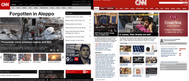 New CNN.com (left) vs. Old CNN.com (right)
Wrapping Up
Pressure from Mobilgeddon and industry buzz about RWD may have you feeling like you need to convert your site overnight. However, before you risk killing conversions with an improperly designed website, step back and take inventory of what you’ll need to consider before taking the leap.
©2024 FUZE DIGITAL INC. Ignite Your Brand™ | privacy


